Qualitative research delves into the “why” behind phenomena, exploring complex concepts through interviews, observations, and text analysis. But how do you make sense of all that rich, nuanced data and present it in a clear, compelling way? This is where the real art of qualitative research lies. It’s not just about crunching numbers; it’s about weaving a narrative that reveals the deeper meaning and insights hidden within your findings.
 Presenting Qualitative Data
Choosing the Right Presentation Method
The first step is choosing the best way to showcase your data. Unlike quantitative research that often relies heavily on tables and graphs, qualitative data thrives in a more flexible format. Here are some popular methods:
- Narrative Text: This traditional approach uses descriptive language to tell the story of your research. It’s ideal for presenting rich, detailed findings from interviews or case studies.
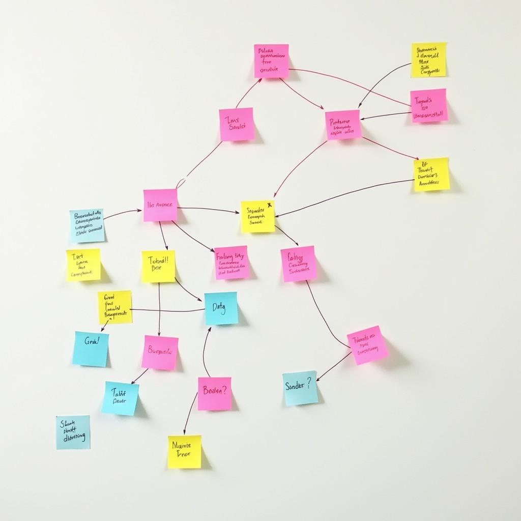
- Thematic Analysis: This widely used method involves identifying and interpreting patterns (themes) within your data. You can present these themes as a list, in paragraph form, or even visually with a mind map.
- Direct Quotes: Nothing brings research to life like the actual words of your participants. Use quotes strategically to illustrate key themes, highlight contrasting viewpoints, or add emotional depth to your findings.
- Visual Aids: Don’t underestimate the power of visuals! While quantitative data loves charts and graphs, qualitative research can benefit from more creative options like word clouds, concept maps, infographics, and even illustrations.
Telling a Story with Your Data
The key to presenting qualitative data effectively is to think like a storyteller. You’re not just presenting facts; you’re crafting a narrative that engages your audience and helps them understand the significance of your findings. Here’s how:
- Start with a Clear Research Question: What were you trying to understand? Framing your presentation around your research question will provide context and direction.
- Identify Your Key Themes: What are the most important patterns or insights that emerged from your data? These themes will form the backbone of your presentation.
- Use Strong Visuals: Images, diagrams, and other visual aids can make complex information more accessible and engaging.
- Don’t Be Afraid to Get Creative: Qualitative research allows for creativity in your presentation. Think outside the box and find unique ways to bring your findings to life.
 Identifying Themes in Qualitative Research
Ensuring Trustworthiness and Rigor
While qualitative research embraces flexibility, it’s crucial to maintain rigor and ensure the trustworthiness of your findings. Here are some key considerations:
- Triangulation: Have you used multiple data sources or methods to validate your findings?
- Member Checking: Have you shared your interpretations with participants to ensure accuracy and get their feedback?
- Reflexivity: Have you considered your own biases and how they might have influenced your analysis?
- Thick Description: Are you providing enough context and detail so that others can understand the reasoning behind your interpretations?
 Analyzing Qualitative Data
Common Qualitative Data Presentation Mistakes to Avoid
Even with the best intentions, there are common pitfalls to watch out for:
- Overwhelming Your Audience with Data: It’s tempting to include everything, but focus on presenting the most significant findings that directly answer your research question.
- Ignoring Negative or Contradictory Data: Acknowledging limitations and presenting a balanced perspective strengthens your credibility.
- Making Generalizations: Qualitative research is about understanding a specific context, not making broad claims.
- Using Jargon: Make your findings accessible to a wider audience by using clear, concise language.
Conclusion
Presenting data in qualitative research is both an art and a science. By carefully selecting your presentation methods, crafting a compelling narrative, and maintaining rigor, you can effectively share the rich insights gleaned from your research. Remember, your goal is not just to present data, but to illuminate understanding and spark meaningful conversations.
FAQs
What are some software tools that can help with qualitative data analysis and presentation?
Several software options can streamline your qualitative research process. NVivo and ATLAS.ti are popular for managing large datasets and conducting thematic analysis. For creating visually appealing presentations, consider tools like Canva or Prezi.
Is it necessary to use visual aids when presenting qualitative data?
While not mandatory, visual aids can significantly enhance the clarity and impact of your presentation. Visuals help to break up text-heavy content, making it more engaging for your audience.
Can I present quantitative data alongside my qualitative findings?
Yes, combining qualitative and quantitative data (known as mixed methods research) can create a more holistic understanding. For example, you could use quantitative data to provide context or illustrate the prevalence of a theme identified through qualitative analysis.
Need More Help with Your Research?
Do you have other questions about qualitative research or need assistance with a research project? Check out these resources:
Our team at Paranormal Research is passionate about exploring the unknown. Contact us at 0904826292, email us at research@gmail.com, or visit us at No. 31, Alley 142/7, P. Phú Viên, Bồ Đề, Long Biên, Hà Nội, Việt Nam. We are available 24/7 to assist you.