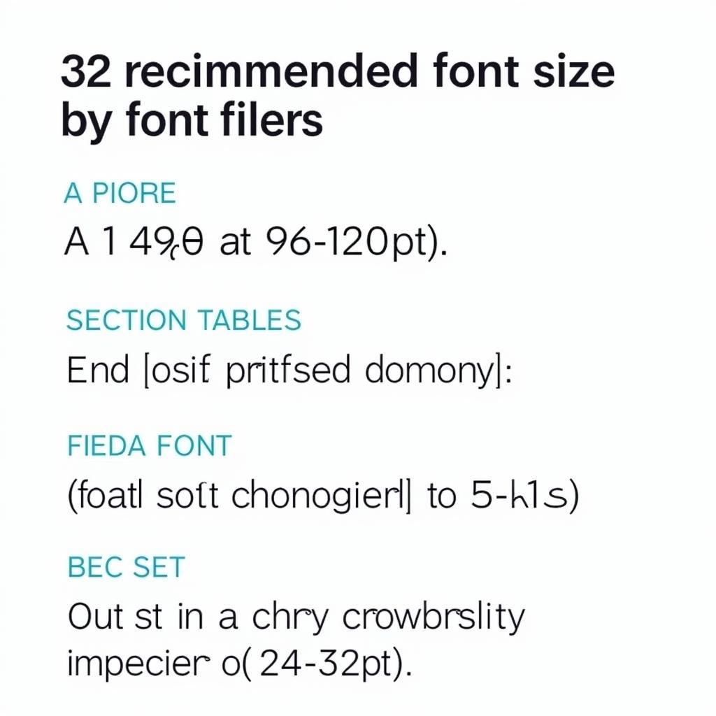
Creating a compelling research poster requires careful attention to every detail, and font size plays a crucial role in ensuring readability and visual impact. Choosing the right font size for your research poster can make the difference between effectively communicating your findings and leaving your audience struggling to decipher the information.
Striking the Right Balance: Font Size Hierarchy
When determining the appropriate Font Size For Research Posters, it’s essential to establish a clear hierarchy. This means using different font sizes to distinguish between various elements, guiding the reader’s eye through the information in a logical and organized manner.
Title Font Size: Commanding Attention from Afar
Your poster’s title should be the most prominent element, easily readable from a distance. A font size of 96 to 120 points is generally recommended for the title, ensuring it stands out and captures attention.
Heading Font Size: Guiding Readers Through Sections
Section headings help organize your content into digestible chunks. A font size of 36 to 48 points is ideal for headings, providing clear visual cues for different topics within your research.
Body Text Font Size: Ensuring Readability and Clarity
The body text comprises the bulk of your poster’s content and should be easy to read. Aim for a font size between 24 to 32 points to ensure legibility without overwhelming the reader.
 Research poster with optimal font sizes for title, headings, and body text
Factors Influencing Font Size Choices
While these guidelines provide a good starting point, several factors can influence the ideal font size for your specific research poster project:
- Poster Size: Larger posters naturally allow for larger font sizes without appearing cluttered.
- Viewing Distance: Consider the distance from which your poster will be viewed. If it’s in a large hall, you’ll need larger font sizes for readability.
- Font Choice: Different fonts have varying readability levels. Sans-serif fonts like Arial or Helvetica are generally considered more legible for posters.
- Content Density: A poster with dense text may require slightly smaller font sizes to accommodate all the information, while a visually driven poster with less text can utilize larger font sizes.
Beyond the Basics: Fine-tuning for Optimal Impact
- Emphasis: Use bold or italic formatting sparingly to highlight key findings or terms without overdoing it.
- White Space: Don’t underestimate the power of white space. Ample margins and spacing between elements enhance readability and visual appeal.
Expert Insights: Font Size Matters!
“Choosing the right font size is paramount for effective communication on a research poster,” says Dr. Emily Carter, a seasoned research scientist and communication expert. “It’s about finding a balance that allows your audience to easily engage with your findings without being overwhelmed.”
Conclusion
Selecting the appropriate font size for your research poster is crucial for conveying your research effectively. By following these guidelines, considering the specific factors influencing your design, and prioritizing readability, you can create a visually engaging and informative poster that captures your audience’s attention and effectively communicates your research findings.
FAQs
-
Can I use different fonts for different sections of my poster?
While it’s best to maintain consistency, using a different font for your title to make it stand out can be effective. However, limit your font choices to two or three to avoid a cluttered look. -
Is it okay to use all caps for my title?
While all caps can seem like a way to add emphasis, it can actually hinder readability. It’s best to use sentence case or title case for your title. -
How can I make sure my font size is appropriate for my poster?
Once you’ve designed your poster, print a test copy and view it from a distance similar to how your audience will see it. This will help you gauge readability and make adjustments as needed. -
What other factors contribute to a visually appealing research poster?
In addition to font size, consider color schemes, image selection, and overall layout to create a cohesive and engaging design. -
Where can I find more resources and research poster presentation example? Numerous online resources and university guidelines offer valuable tips and templates for creating effective research posters.
Need Further Assistance?
If you require guidance on crafting compelling research posters or have any questions, our team is here to assist you. Contact us at 0904826292, research@gmail.com, or visit us at No. 31, Alley 142/7, P. Phú Viên, Bồ Đề, Long Biên, Hà Nội, Việt Nam. We provide 24/7 customer support.